Home Page Dashboard
Sprout At Work
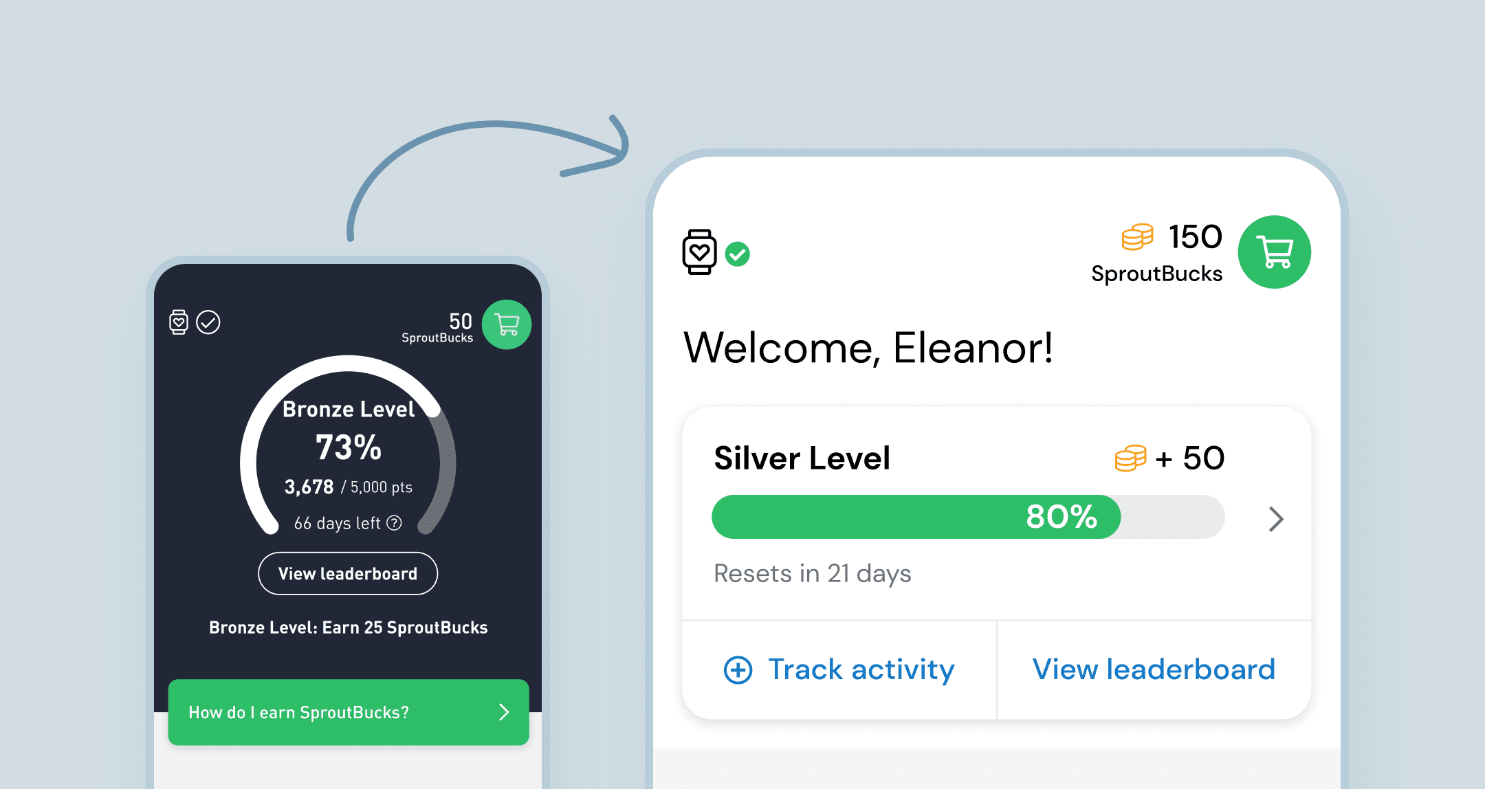
Sprout's customers (businesses) and end users (their employees) hated the confusing, unattractive progress display shown at the top of Sprout's homepage.
I fully redesigned this crucial touchpoint, using video game UI conventions, user data, and usability tests to guide and validate my design decisions.
Background
Sprout At Work is a gamified health app in which users track activity to earn points and pass levels.
Upon joining the team in 2020, I was immediately under pressure to fix the "Black Box" – a dark and confusing dashboard at the top of the home page. This placement makes it the most prominent visual element in the app, and it also serves a crucial purpose.
The problem
The existing design was harming the user experience in a few important ways.
👎 Visual problems
Both customers and end users (our customers are not the end users) found this section ugly and out of place in a wellness app. We even lost a client because they found it so unpleasant!
👎 Usability issues
New users were failing to understand how the app works because the Black Box was confusing and overwhelming. This was dragging down our Net Promoter Score, which was evidenced by detractor comments.
Phase 1: Stopgap improvements
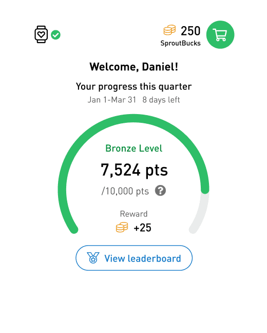
Given the urgency given to this problem, I began with simple, low risk style changes that we could build and ship within a month. Some of the improvements here:
✅ No more black box! White space with bright colours feels lighter, happier and more energetic.
✅ Added a welcome message to for a more personal and friendly touchpoint.
✅ Show progress in points instead of percentage. Rough percentage is already discernible from the progress visual.
✅ Introduced new currency icon to lighten cognitive load.
I conducted usability tests ad-hoc as I worked on this iteration, and ran a final round of tests at the end to validate that it was more intuitive and subjectively attractive.
Phase 2: Usability improvements
This second phase was focused on improving the usability of this dashboard. My objective was to design a dashboard that more intuitively communicates the game mechanics and the user's progress.
🎯 Find a more intuitive progress visual
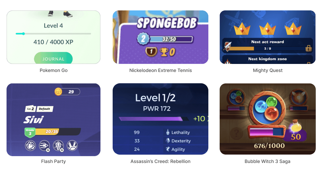
Given that this dashboard is displaying points and levels, I investigated common video game UI patterns for that. (Full disclosure: I am not a gamer).
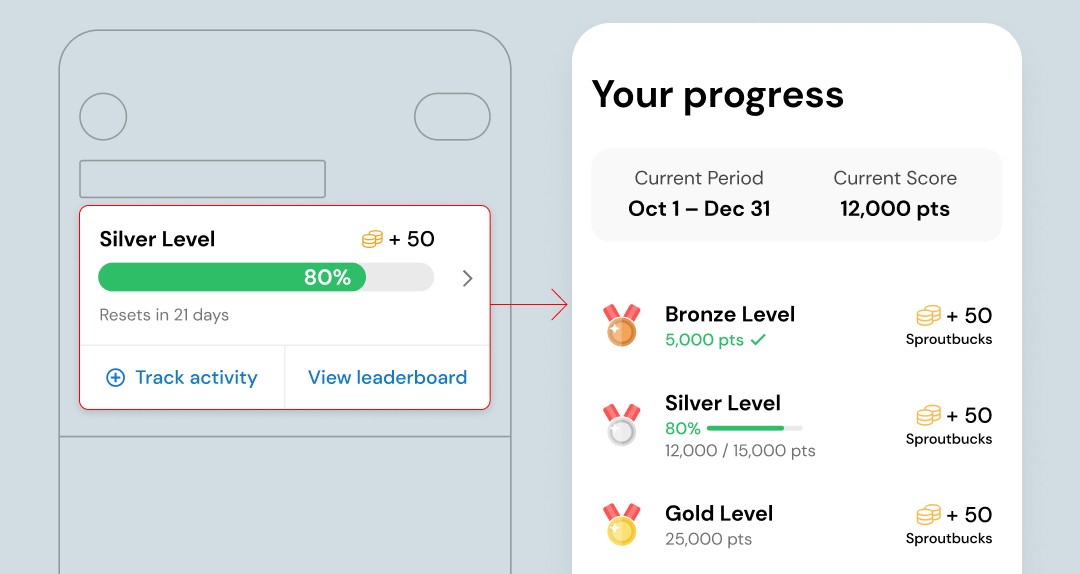
A horizontal points meter is a very common pattern for presenting game status information, often accompanied by icons indicating forthcoming rewards, so I felt this would be a more intuitive progress visualization.
🧠 Reduce cognitive load
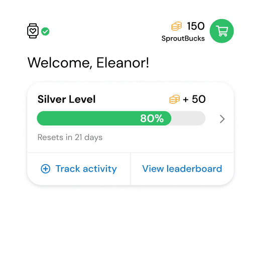
Using the horizontal progress bar pattern, I reorganized the key game status information in a more intuitive and familiar way, while optimizing the information being displayed. I removed the points count, as it was drawing attention without being particularly actionable.
The final redesign leverages the familiar horizontal progress bar pattern and minimizes non-actionable information.
✅ More minimal and conventional layout of information and graphics
✅ Track activity button added to hint at the action that will fill up the bar, and makes it easy to take the action.
🎓 Help users learn more
In my usability tests, participants tended to click on the progress meter, expecting to navigate to more detailed information. I leaned into that, and created a new page to show to break down the points, levels and date period.
How I tested
Throughout my process I ran ad hoc remote usability tests with low/mid fidelity prototypes, and iterated based on the results. I used UserInterviews.com to get my participants, which was an inexpensive way to get invaluable feedback.
In the final stages of design I ran two rounds of usability testing to measure:
How well participants correctly understood the design compared to the previous
How visually appealing the new design was to the participants compared to the previous
My tests validated that the new design improved usability and aesthetics, so I felt confident about moving into development.
