Manual Activity Tracking
Sprout At Work
Sprout At Work's users were extremely frustrated with our complicated manual activity tracking feature. I redesigned it to be more streamlined and intuitive, using data analysis and usability testing to shape my designs.
This project, alongside other UX improvements, resulted in a 37% increase in our Net Promoter Score and 13% increase to our monthly engagement rate.
Background
Sprout At Work is a gamified health and wellness app in which users track healthy activity – jogging or meditation, for example – to earn points and pass levels.
Users can track activity automatically by connecting to a wearable, or manually by inputting in the details – date, activity, and quantity.
The problem
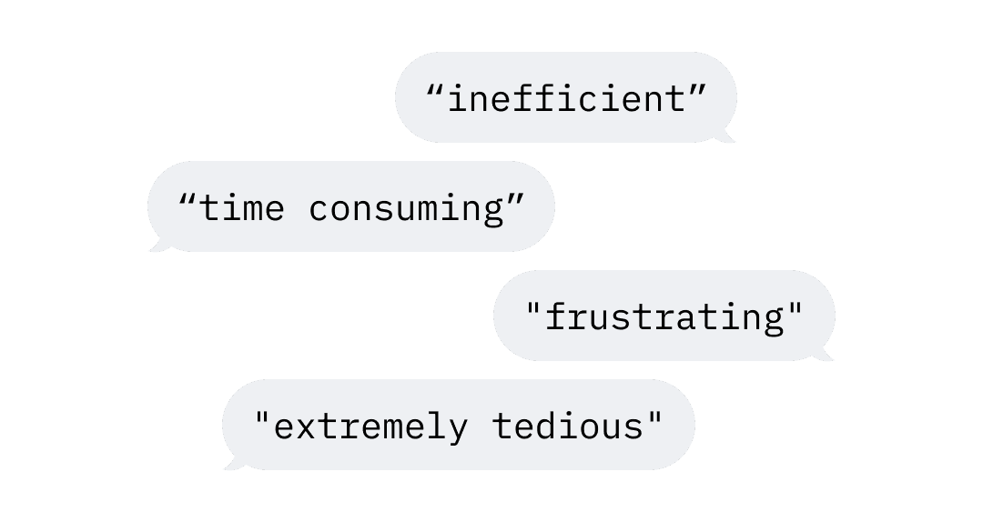
The manual activity feature is central to the app experience, and users were reporting that it was extremely frustrating to use. I analyzed hundreds of comments submitted through our Net Promoter Score survey and identified two key failures:
👎 It's difficult. Learning and using the feature was not intuitive and the flow felt illogical.
👎 It's inefficient. The flow is overly complex, time consuming, and requires 'too many clicks.’
Investigating the failures
"Difficult" and "inefficient" are both broad descriptors, so I needed to zoom in on these usabilitiy fails.
What made it difficult?
To answer this I conducted a heuristic evaluation, and the results were bleak; the existing design failed 9 out of Nielsen's 10 heuristics. I therefore proposed that we undertake a full redesign that adheres to usability best practices.
What made it inefficient?
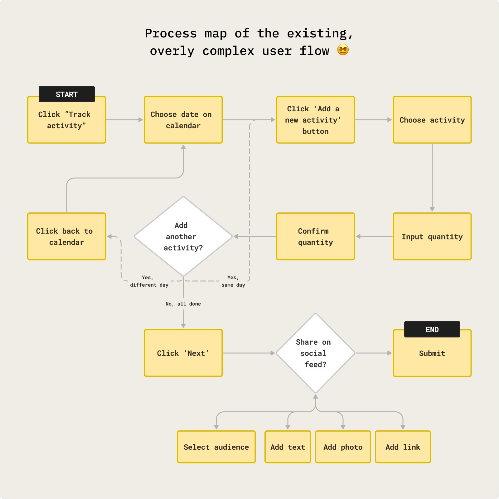
To clarify the inefficiency I mapped out the existing user flow. It took at least 8 actions to complete the simplest task. It also jumped between multiple mental models, adding to the cognitive load. Our redesign should therefore meaningfully reduce the number of actions and decisions required.
Understanding user needs
Now that I understood the usability issues more clearly, I needed to find opportunities to reduce, optimize and streamline the flow.
Since users were complaining that it was inefficient, I wanted clarity on how people track activity. If I could find common trends, I could focus on making those use cases as frictionless as possible.
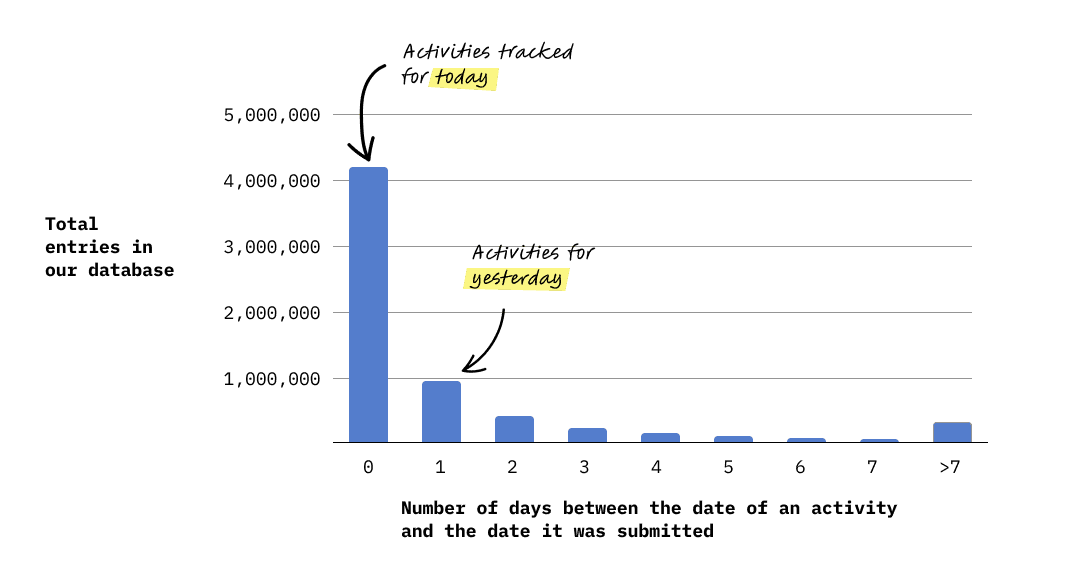
I wrote SQL queries to extract activity data from our database and indeed found important patterns. Two insights were especially relevant to design decisions I made:
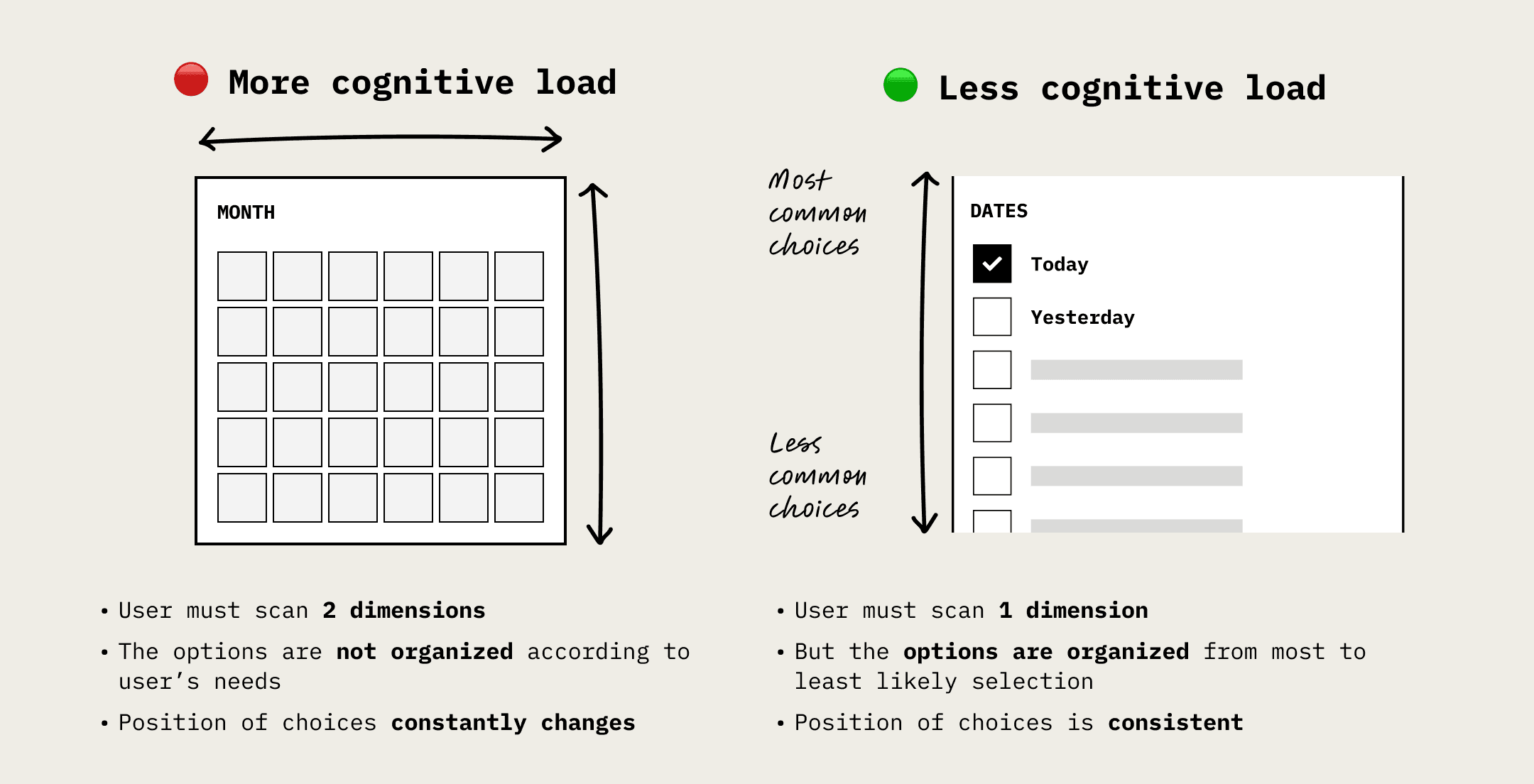
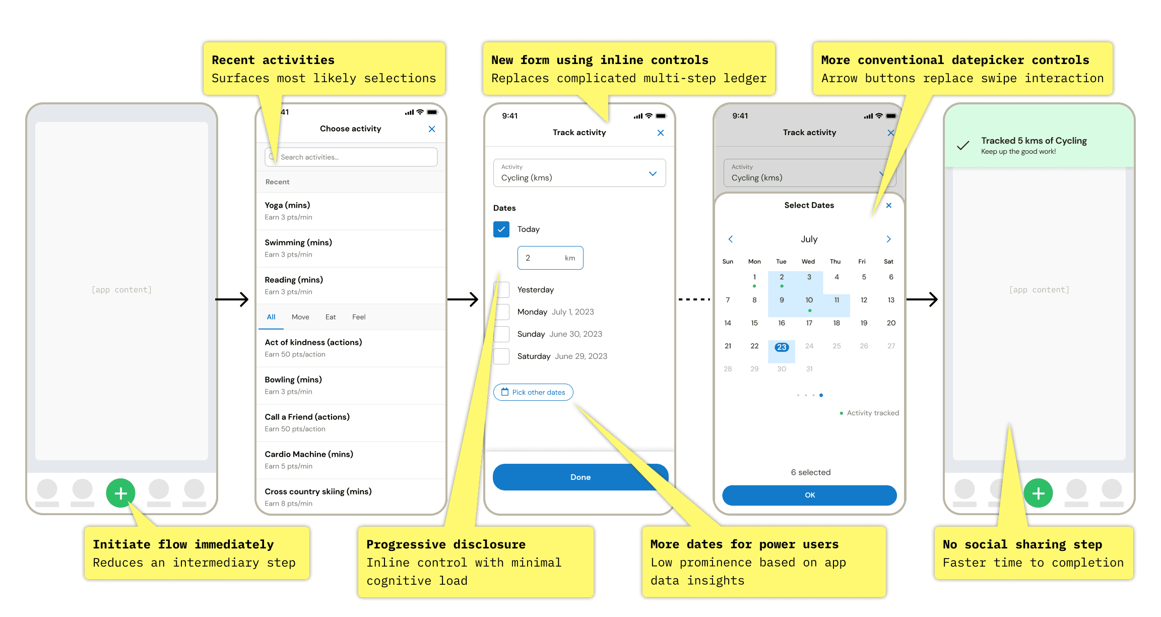
The current flow required users to click the date they wanted to track for on a calendar input. But the majority of the time, users were simply choosing today's date. Choosing yesterday was less common, choosing two days ago was less common than that, and so forth.
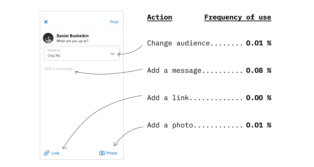
2) Social media features are barely used. Users chose to publicly share their activity only 0.1% of the time. Other abilities, like adding text, photos or links, were essentially 0%.
Do we need this screen at all?
Designing a solution
Some notable ideas that made it into the final concepts:
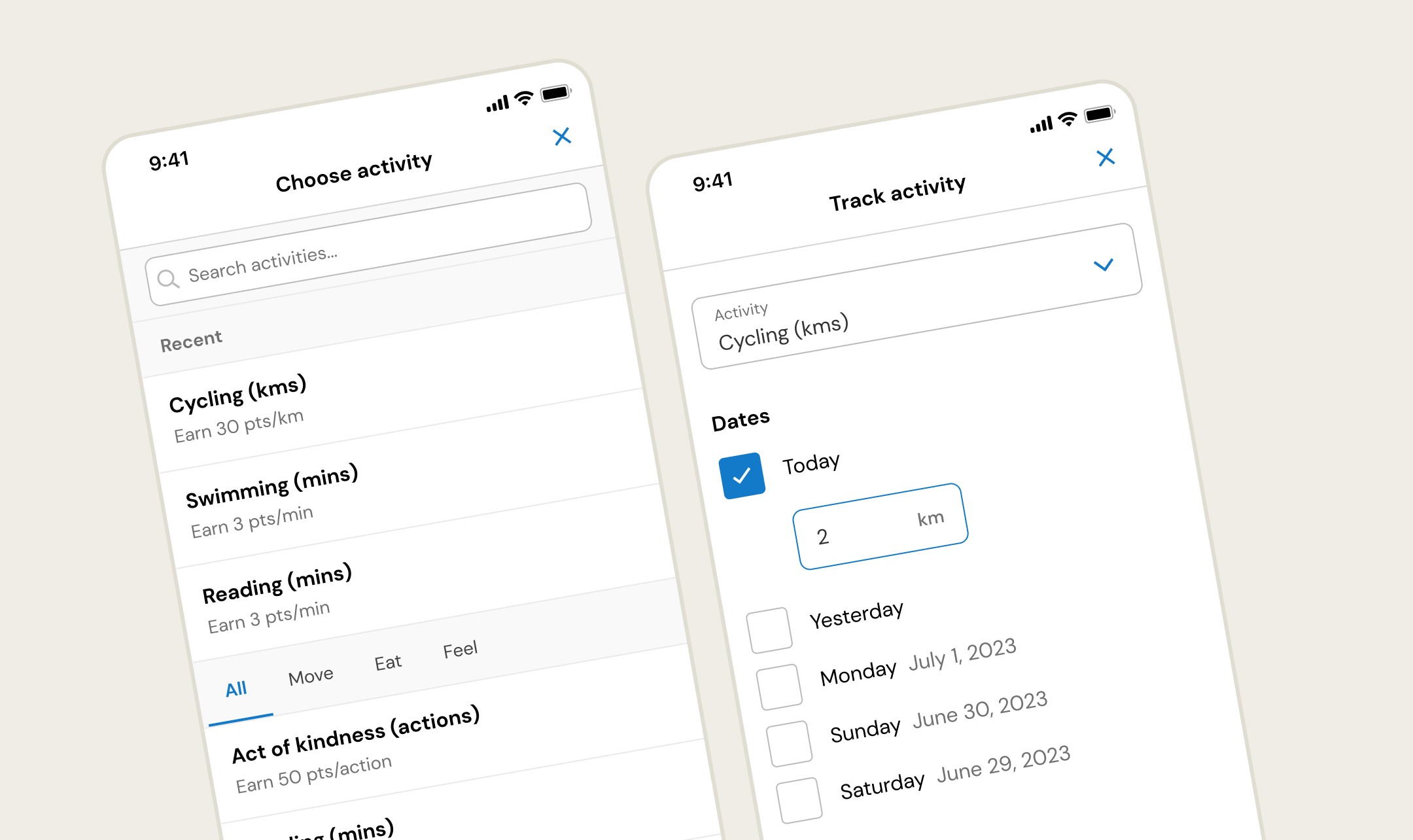
Begin the flow with choosing an activity, instead of picking a date from a calendar. The subject of activity tracking is the activity itself, not the date. That's what this app is all about!
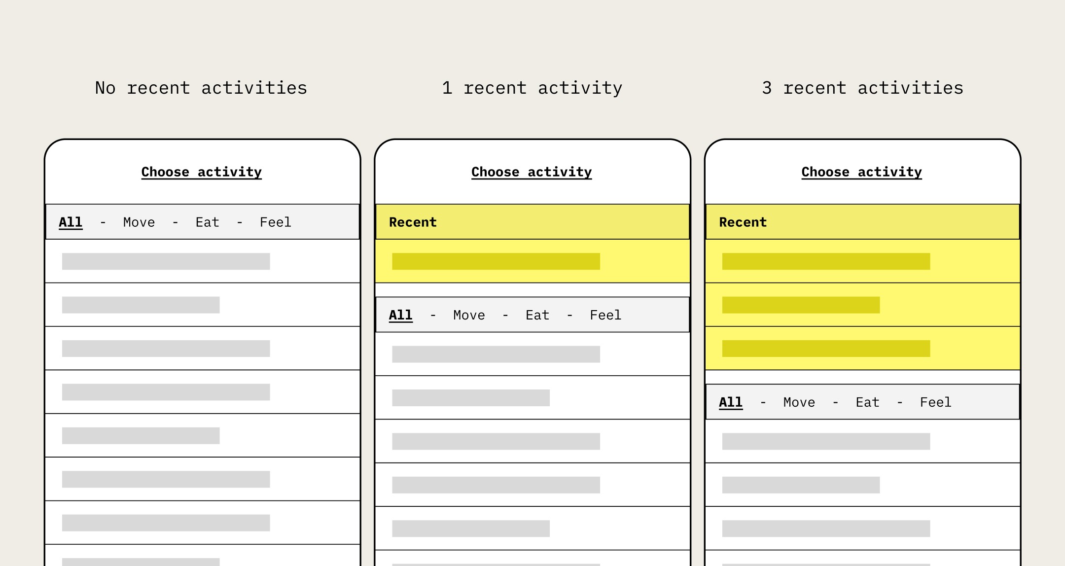
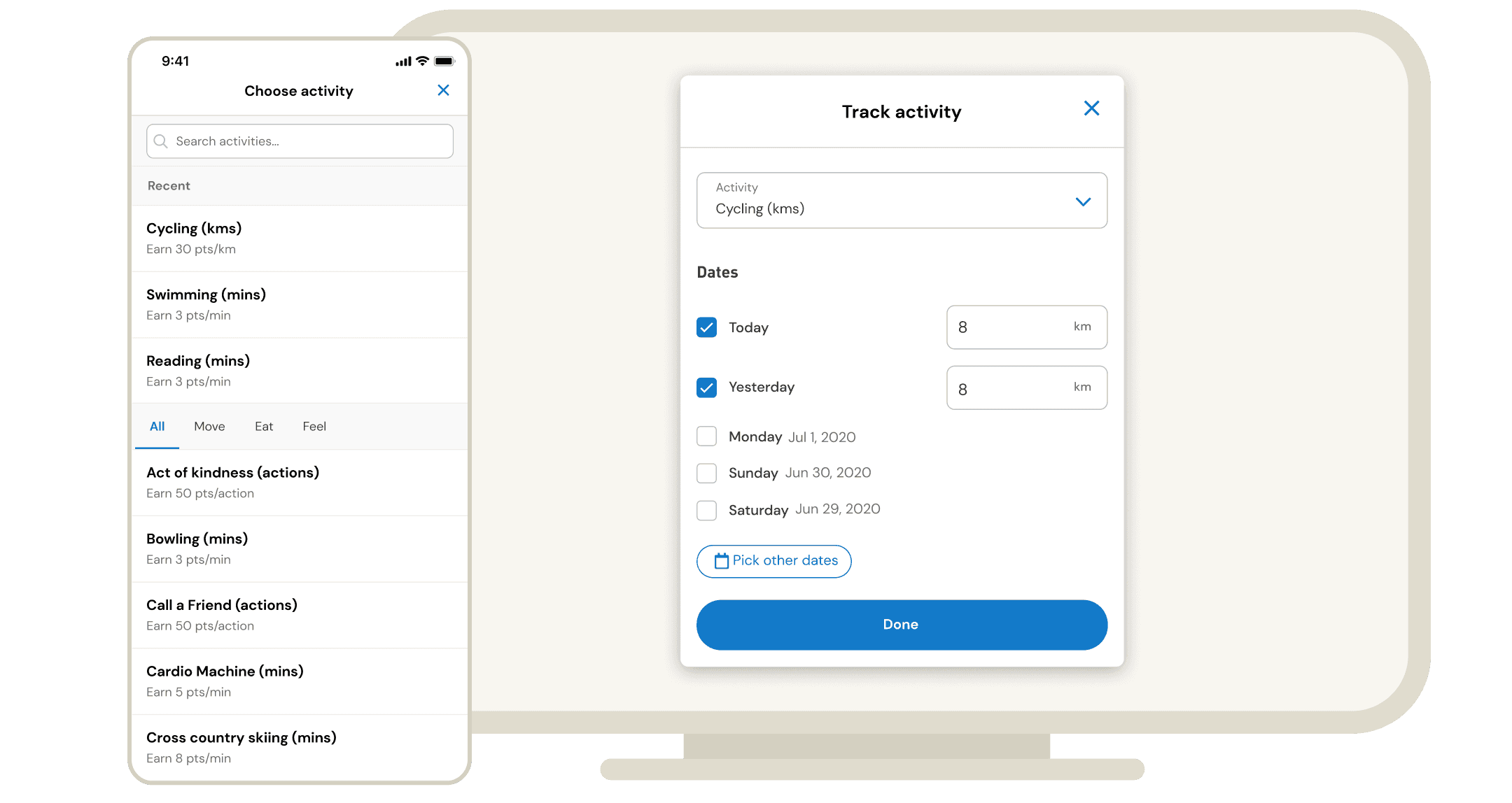
Show recently tracked activities at the top of activity list. Users told us that they track the same activities repeatedly – hobbies and habits. This shortens time to select.
Change date picking to vertical list of dates. The data shows that users are most likely to choose the top options, so this is a more efficient organization.
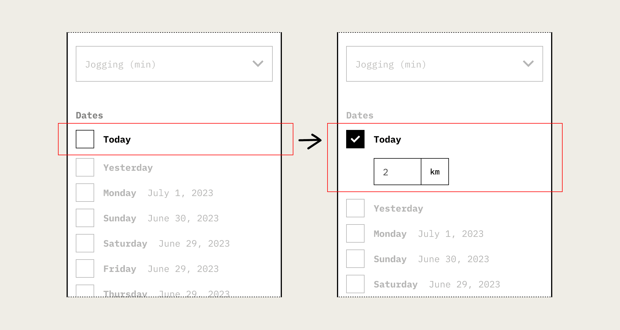
Use inline inputs with progressive disclosure. This keeps cognitive load low while supporting multiple entries.
Validating the solution
I conducted moderated usability tests with both existing users and non-users. Designs were evaluated on the participant's task completion & self-reported ease of task.
Interestingly, the most difficult task for users for users was simply discovering the button for tracking activity. This major feature, which I was redesigning, wasn't adequately discoverable in the first place! In order to stay focused on the tracking flow, I deferred that pain point to address later.
Results
The feature was launched with an in-context survey that asked users to rate their experience. We received 1,500 responses, showing that the new design was well received. 66% included a comment that specifically complemented the usability qualities I had specifically targeted: ease and efficiency.
We shipped the redesigned feature in early 2021, and by the end of the year our NPS score increased 37% and our engagement rate increased by 17%, and this feature had direct impact on that growth.
And, thankfully, we saw a dramatic reduction in complaints about mentioning manual activity tracking. Phew!
